The Challenge
The mere mention of website templates makes some clients bristle. Nobody likes being told they have to conform to a set of rules they feel weren’t written with them in mind. They also believe that their site will look like everyone else’s and not meet their unique needs.
Developers and designers also get concerned with templates, unsure if content editors will put the correct types of content in pre-built components. Sites that the development and design team spent a lot of time building can end up looking unprofessional if the templates aren’t used properly. No one wins in this scenario.
The Solution
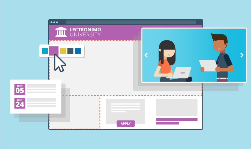
Let’s first dispel the myth that using templates means your site will look like everyone else’s. When we talk about templates, we aren’t talking about simple differences in colors and fonts. Our Lectronimo website solution takes advantage of Drupal’s modularity and Panelizer to deliver different frameworks that solve common UX mistakes, and still allows creativity when it comes to content.

The Lectronimo templates are built for many different components that can be mixed and matched to highlight your best content, and they don’t require you to strictly adhere to a formula. People with lots of videos aren’t limited by the page structure, and people with complex written content have various ways to display that information so that users can scan and explore -- without feeling like they’re reading a novel.
To keep each Lectronimo website solution maintaining its professional appearance and supporting the content strategy, we worked by the philosophy that any content our users can place should actually work, both in terms of functionality and in design. To us this meant that we needed to place some limits on where our users can put things. We’ve applied some preprocess hooks to the Panels ‘Add Content’ dialog to ensure that whenever a user goes to add content to any region, the list of content types will have been filtered accordingly. Our custom IPE also uses Javascript variables via Ajax commands to prevent content editors from dragging & dropping existing content into invalid regions.
At the same time, we didn’t want to build a set of draconian rules that would leave users feeling trapped or limited, so we primarily assigned our region types based on where content might make sense, and avoided using this system as a crutch to resolve design limitations. For example, there’s a content plugin specifically for adding short intro text to the top of a page. From our experience we knew it would create an inconsistent experience to have that same style of text appear in the middle of the page, or in a sidebar, or anywhere other than the top of the content.
To resolve the design problems that arise when large content gets placed into small regions, our content plugins work in tandem with our layout templates. Plugins are enabled to automatically swap out some styles based on their region placement. We achieved this by establishing a convention that every region in every panel layout must follow one of three spatial patterns: Full Width, Wide, or Narrow.
A region declares its pattern just by including a class in the layout template. From there, the principles are very much like responsive design: Just as we would apply different styles on small displays vs. large displays through media queries, we can apply extra styles to content within narrow or wide columns via our standardized classnames. This contributes to a robust design experience, allowing content authors to place content freely without worrying about breaking the design. Everybody wins!
If you’re interested in learning more about our journey to develop our Lectronimo solution, check out parts 1 & 2 to this blog series: Making a Custom, Acquia-Hosted Site Affordable for Higher Ed, and Custom Theming that is Robust and Flexible Enough to Continue to Impress.
We’re excited to bring Lectronimo to market! If you’re a higher ed institution exploring options for your upcoming redesign and want to know more about Lectronimo, or if you’re in another market and want to talk about your next project, Digital Wave’s team is happy to help.


