In this final installment of our series on conversational usability, we dig into a case study that brings together all of the ideas and best practices we have discussed so far: the Ask GeorgiaGov skill built by the Acquia Labs team for Digital Services Georgia. Released a year and a half ago, the Ask GeorgiaGov Alexa skill answers common questions that Georgia state residents have about issues like driver’s licenses, relocating to Georgia, filing complaints against businesses, and even enrolling children in pre-kindergarten.
While we at Acquia have long espoused Ask GeorgiaGov as an example of what Drupal can do for conversational interfaces, we have not yet embarked on a deep dive into how we designed and implemented the Amazon Alexa skill at the center of it all—nor an exploration of how we endeavored to make Ask GeorgiaGov usable and accessible. In this final foray into conversational usability, we look at the good and bad, the risks and rewards, and the highs and lows of the Ask GeorgiaGov conversational interface.
Georgia.gov: From website to Alexa skill
We had several goals while architecting the Ask GeorgiaGov skill. First, we wanted to adhere to the identifiable value propositions that would make the skill something that users would find useful. We identified getting information to citizens faster, widening access to information and making it more inclusive, and practicing open innovation as key facets of the eventual interface we built.
In addition, due to limited staffing and resources in state government, we endeavored to reduce friction for the editorial team by building toward a single source of truth for content. In short, there would be only one version of content shared across both the website and any other interfaces that demanded it—in this case an Amazon Alexa. As such, we needed to establish two inviolable criteria for the eventual editorial experience.
First, the editorial workflow of Georgia's editorial staff must not be burdened by the addition of conversational content; that is, no additional work should need to happen for conversational content to be enabled. Second, editing an item of web-based content versus an item of conversational content should be indistinguishable; that is, the user experience of editing both types of content should be identical—as it would logically be in an approach leveraging unified content as a single source of truth.
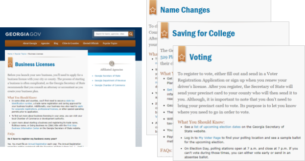
Thanks to its use of Drupal 7 and structured content, the Georgia.gov website was already well-positioned for conversational interfaces. The "Popular Topics" section of the site acts as a "frequently asked questions" section that provides, for several dozen topics important to Georgia citizens, answers to key queries about interacting with state government. In the image above, for instance, are the pages for business licenses, name changes, saving for college, and voting.
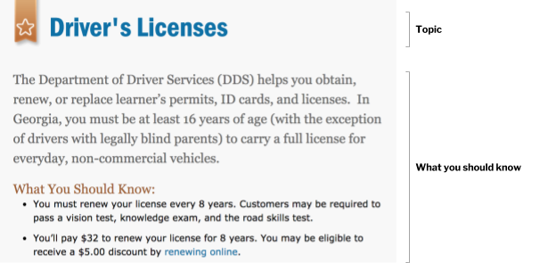
Each of these "Popular Topics" pages is divided into an initial description that acts as a summary of the topic, a "What You Should Know" section that provides a bulleted list of important information, and finally an "FAQs" section that offers answers to questions not already addressed by the previous two sections. In the image below, for example, we can see a division between the topic title ("Driver's Licenses") and the "What You Should Know" section underneath.
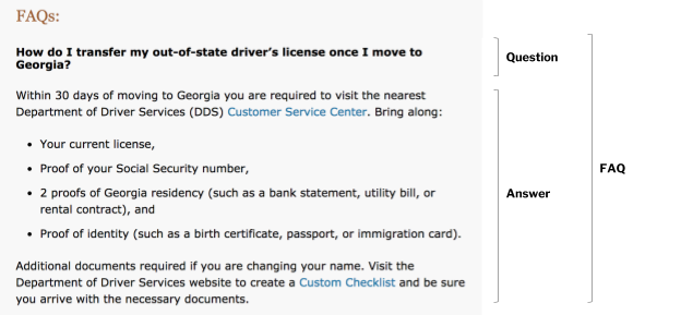
Each topic page also contains a series of frequently asked questions which can be further subdivided into questions and answers, as you can see in the screenshot below.
This relatively complex content model, where frequently asked questions are considered part of an existing topic page, means that whereas conversational interactions are easily derived from the already interlocutory nature of these FAQs, the page structure proves to be an obstacle to an easy one-to-one match between topic pages and interlocutions in a conversational interface.
To mitigate this, we chose to design Ask GeorgiaGov and structure the accompanying content in such a way that would allow users to traverse the entirety of a topic page's content without being overwhelmed by the sheer quantity of content available on that page. In addition, the diversity of content across the topic page allows for a differentiation of certain types of content (e.g. "What You Should Know" section versus a question-and-answer pair) that further gives the user of a conversational interface an implicit understanding of how the content is structured.
In the next section, we dive into some of the unexpected findings we discovered during the process of designing interaction flows and writing language.
Designing Ask GeorgiaGov: Flows and language
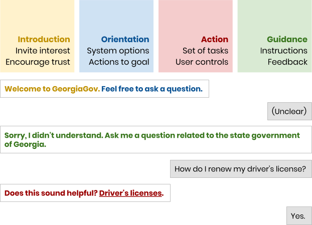
In crafting the appropriate language for Ask GeorgiaGov, we sought to soothe many users' anxieties around interacting with government by focusing on Erika Hall's key moments and in particular welcoming the user with a reassuring greeting: "Welcome to GeorgiaGov. Feel free to ask a question." This introduction not only invites trust from the user but also provides the initial instruction necessary for the user to interact with the Alexa skill.
Related to helping users relax when faced with an unfamiliar interface is the notion of providing friendly feedback to the user that helps them understand not only what went wrong but also how they can mitigate it: "Sorry, I didn't understand. Ask me a question related to the state government of Georgia." At each juncture, the Ask GeorgiaGov Alexa skill immediately answers and provides an opportunity for the user to confirm each interaction.
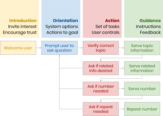
The Acquia Labs team landed on the appropriate structure for interaction flows by evaluating the discoverability of each node of content and the ability for the user to ascend back up the interface to the starting point. As you can see in the flow diagram above, which also adheres to Hall's key moments, there is a clear chain of accessing related content that occurs as the user interacts more with the interface. But nonetheless, as the user continues to descend, there is always an opportunity provided for the user to ascend back to square one and avoid conversational limbo.
Designing flows is challenging and often can only occur once you have a clear understanding of all the possibilities you want to provide to the user. In Acquia Labs' case, we chose to articulate the desired flows after some of the interface was already built in order to visualize how users' trajectories would differ and to provide an understandable structure that proved useful in debugging. Nonetheless, as mentioned previously in this series, it's important to consider both the flows you draw and the language you write as you begin the design process, even if you opt to leave some of the formalities until later.
Content strategy: A conversational content audit
As we've seen throughout this series, content strategy is another area that is of paramount importance when architecting conversational interfaces, because the way that you handle content differs from a website to a conversation. We experienced this firsthand when adapting previously web-based content on Georgia.gov to be more flexible in a cross-channel fashion. As mentioned in the column on conversational content strategy, one way to approach conversational content when you aren't sure where to start and have pre-existing content is to embark on a conversational content audit.
While new readers return to the post on conversational content strategy and get up to speed on content audits, we press ahead here with an accounting of how we launched a conversational content and, with the kind support of Georgia.gov's editorial team, adjusted content in dozens of ways and in hundreds of places to prepare it for use not only in a conversational interface but also in other non-web channels that Georgia is interested in pursuing in the future. Moreover, because our Alexa skill forwards utterances to a Drupal search engine, we needed to ensure that users could access content even when using unfamiliar or nontraditional search terms.
Some of the content elements we paid particular attention to included the topic titles themselves, which may not reflect the search terms used by users; questions and answers, which may be ambiguous or may not mirror the ways in which users phrase questions; and individual links in questions, which pose specific problems for conversational interfaces without a visual component. After all, no one can easily follow a link in an Alexa skill to access referenced content—this connection has to be explicitly given by the interface itself.
Many of the modifications we made were intended to reduce ambiguity or to improve searchability. For instance, the word benefits can have multiple meanings based on the context in which it is used and the nature of the benefits themselves. In this way, users can search for "unemployment benefits" on Amazon Alexa without encountering the ambiguity inherent in the word benefits:
Before: How long can I receive benefits? After: How long can I receive unemployment benefits? Before: Are benefits taxable? After: Are unemployment benefits taxable?
Links and link-rich text can be particularly difficult headscratchers in conversational content strategy, because they are uniquely useful on web and mobile but much less so in conversational interfaces, which cannot allow the user to become to distracted by linked tangents. In the Georgia.gov case, this was further complicated by the fact that many of the links led to external agency sites rather than other pages within the existing Georgia.gov content database.
After some discussion, the Acquia Labs team and Georgia.gov editorial staff chose to keep links intact on the website in order to maintain the same functionality as before but to contextualize them more so that they would not trip up conversational users. This meant avoiding calls to action such as "Learn more" or "Read more" and limiting obvious issues such as parenthetical "PDF" annotations after links to file attachments. What follows is an example of how we recontextualized links and minimized confusing calls to action:
Before: Learn how to change your name on your Social Security card. After: The Social Security Administration can help you change your name on your Social Security card.
In other cases, we removed calls to action entirely and placed links in existing sentences where they would be more efficiently contextualized for web users and less confusing for conversational users:
Before: You can receive payments through either a debit card or direct deposit. Learn more about payments. After: You can receive payments through either a debit card or direct deposit.
There were also instances where due to a complete lack of context, such as an FAQ answer that solely consisted of a linked call to action, we needed to add the necessary context to the FAQ response:
Before: Read more about this. After: In Georgia, the Family Support Registry typically pulls payments directly from your paycheck. However, you can send your own payments online through your bank account, your credit card, or Western Union. You may also send your payments by mail to the address provided in your court order.
Ultimately, we were cheered by the side-effect of web-based content serving website users in a much-improved way, in addition to fulfilling our primary mission of allowing conversational users to interact with the voice interface unencumbered.
Retrospective probing: Alexa usability testing
The final section of this column (but by no means the final step of the implementation of your conversational interface) concerns usability testing when it comes to voice assistants and voice interfaces like Amazon Alexa and Google Home, which do not come with screens off the shelf. As we noted in our installment regarding conversational usability testing, due to the unique characteristics of Amazon Alexa and other voice assistants, our own usability testing cannot occur in the same ways that we have seen in web usability testing, especially in order to evaluate every single possible trajectory possible within the interface.
We employed the recommended retrospective probing (RP) approach, as detailed in the previous post. In our usability tests, we gave each of our test subjects a task that would take them through step of the interface, from providing search terms, winnowing down into further questions, and ending with the acquisition of an agency phone number for additional information. Afterwards, we embarked on a frank discussion with users by asking them several questions intended to provide us with hard data on the success of the interface as well as general impressions about the interface according to the users' opinions.
Here are several examples of the scenarios we presented to users:
You have a business license in Georgia, but you're not sure if you have to register on an annual basis. Talk with Alexa to find out the information you need. At the end, ask for a phone number for more information. You've just moved to Georgia and you know you need to transfer your driver's license, but you're not sure what to do. Talk with Alexa to find out the information you need. At the end, ask for a phone number for more information.
As we discussed in the previous installment of this series, usability testing is not a late-stage item for your project; it should be part and parcel of every sprint you complete or every milestone you realize in order to give you a diachronic (over a stretch of time) rather than a synchronic (only at a single moment) understanding of how your interface is performing. Testing early and testing often are the two best means of ensuring you have the best underlying picture of your conversational interface and ultimately, the most optimal interface for your users.
In the end, the Ask GeorgiaGov project was a success despite the challenges we faced in the early days of Amazon Alexa adoption for purposes like sitewide searches and content delivery. By the time we reassessed the performance of Ask GeorgiaGov after eight months had elapsed, we found some interesting outcomes: 79.2% of all interactions were successful, and 71.2% of all interactions eventually led to an agency phone number being provided. And, as a final piece of advice for anyone else endeavoring to improve interactions with state government, the most popular keywords were, in order: vehicle registration, driver's licenses, and state sales tax.
Conclusion: Thank you, readers!
As you have seen throughout this series on conversational usability, it can be rewarding and enthralling to see a conversational interface come to fruition in real life. Nonetheless, there are logistical and practical challenges that emerge as soon as you begin to design a conversational interface in real life. In Ask GeorgiaGov, for instance, some of the most intractable barriers came from the limitations of Amazon Alexa itself and the unique approach that Amazon Alexa skills must undertake. Ultimately, technology can sometimes get in the way of even the most well-considered discovery process and design thinking. It is important as early adopters of a rapidly maturing paradigm to prepare for this outcome as well.
The conclusion of our series on conversational usability also brings with it the bittersweet end of this Experience Express column from yours truly. From the nitty-gritty of decoupled Drupal authentication to the nuances of JSON:API-formatted responses, from the biological underpinnings of conversational design to the essential steps of conversational usability tests, from Alicante to Philadelphia, we have journeyed through many landscapes together, each more different than the last. Though this is the last stop on our travels together, I hope you, dear reader, will continue to venture beyond what’s possible today and map your own itineraries for your digital experiences.
Thanks for joining me along the way! The Experience Express terminates here. Safe travels.


